3 Months
Product Designer
Softwear
What is Design System?
Why Important to build a Design System?
6 Core Benefits
Improved cross functional collaboration: One language developer and designer is used.
Stable Product: There are no multiple inconsistent components. The product automatically becomes stable.
Governance: Everything is in one library, making it easy to control what goes in and what goes out.
Single Source of truth : Duplicates are removed, ensuring consistency and reliability.
Common Language Across team: The design system not only helps align with developers but also with the marketing and social media teams.
Data Driven Result: The components were created based on proper research and testing.
Why did we choose to rebuild
the design system?

Problem Statement

Lack of collaboration between design and development teams.
Inconsistent UI elements (multiple headers, CTAs, colors, typography).
The component set was weak and lacked structure.
It took more time to build and maintain UI screens.
Solutions
Pilot, Driving the Future Growth of Zunu's Product
The design system includes following these key features.

Foundation: A style guide built following WCAG guidelines.
Component: 40+ reusable and robust components.
Design Tokens / Variables: Components are built using tokens and variables for consistency and flexibility.
Design Principles: Ensure our design language remains modern and consistent.


There are two type of Design System Exists.


Under Multi-Brand Design Systems, there are additional key aspects to consider.
A collection of products that share the same brand attributes, such as colors, typefaces, and overall design language, ensuring a unified brand identity.
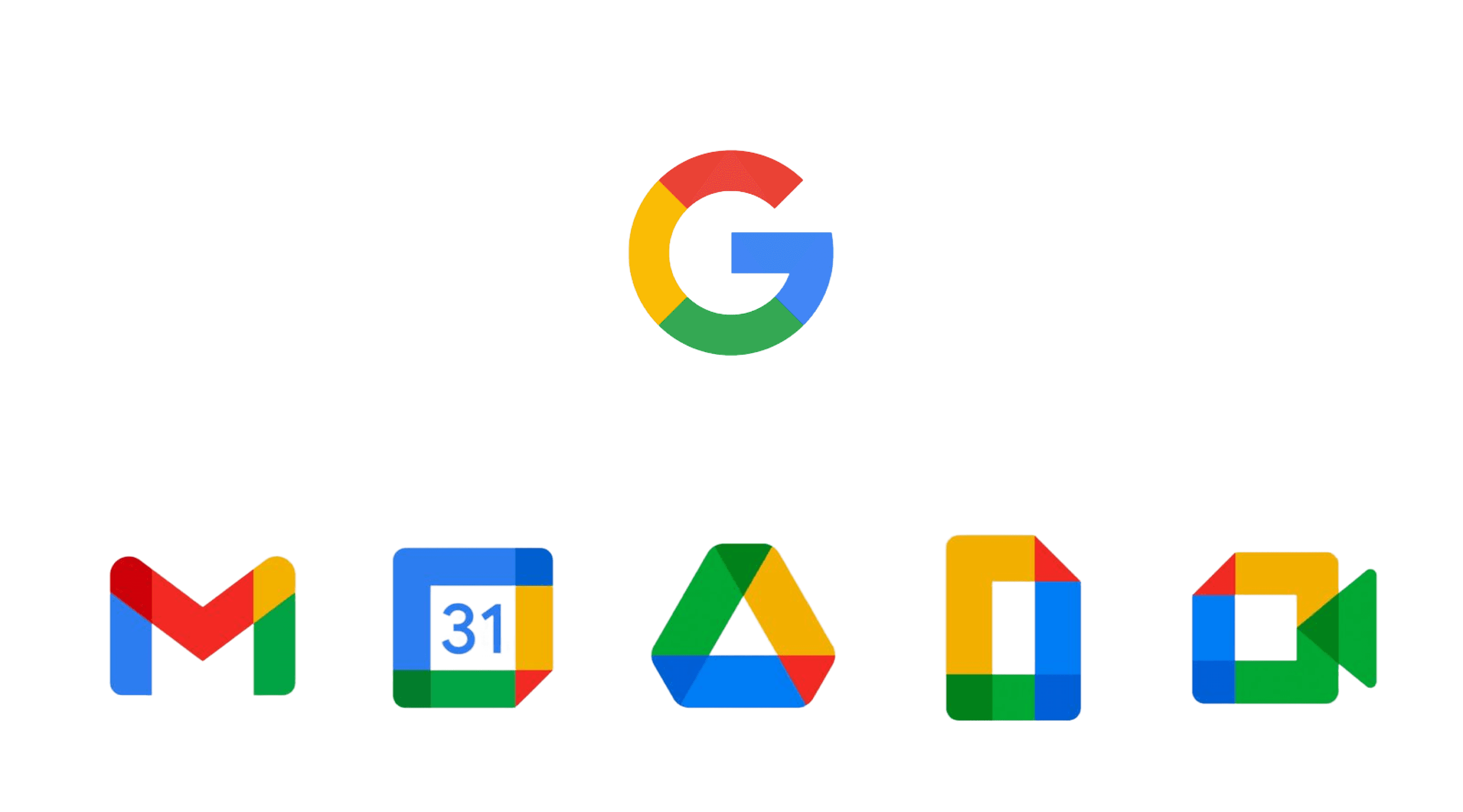
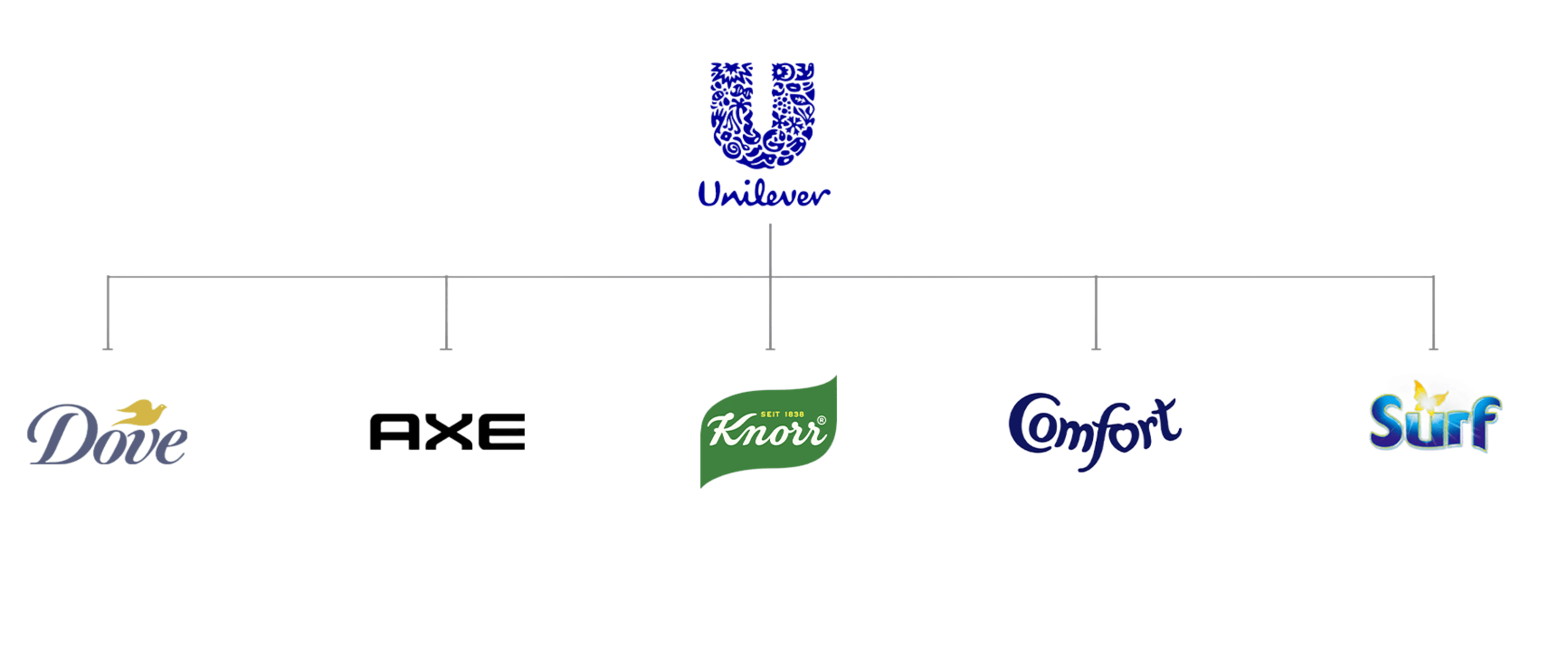
A collection of products that have their own unique brand attributes, for eg. Brand Colors, Brand Typeface etc are said to follow "House of Brands' architecture

Why this Information is important?
For e.g in an organization with branded house archiecture
supporting 4 product.
There will only be 1 main component library.
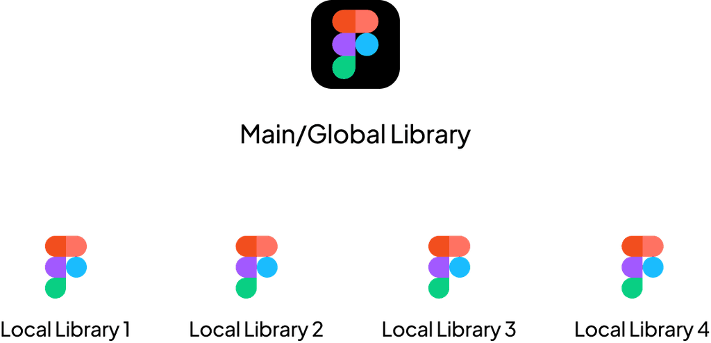
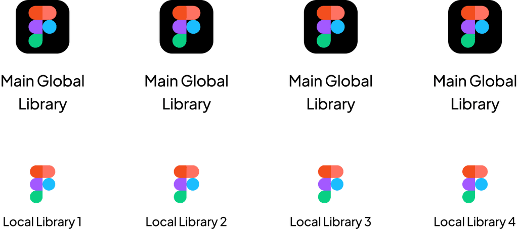
Now, if we are following a House of brands architecture to support the same 4 products.
We will have 4 global Libraries.
Re-looking at our problem statement, what architecture should be chosen for Zunu?
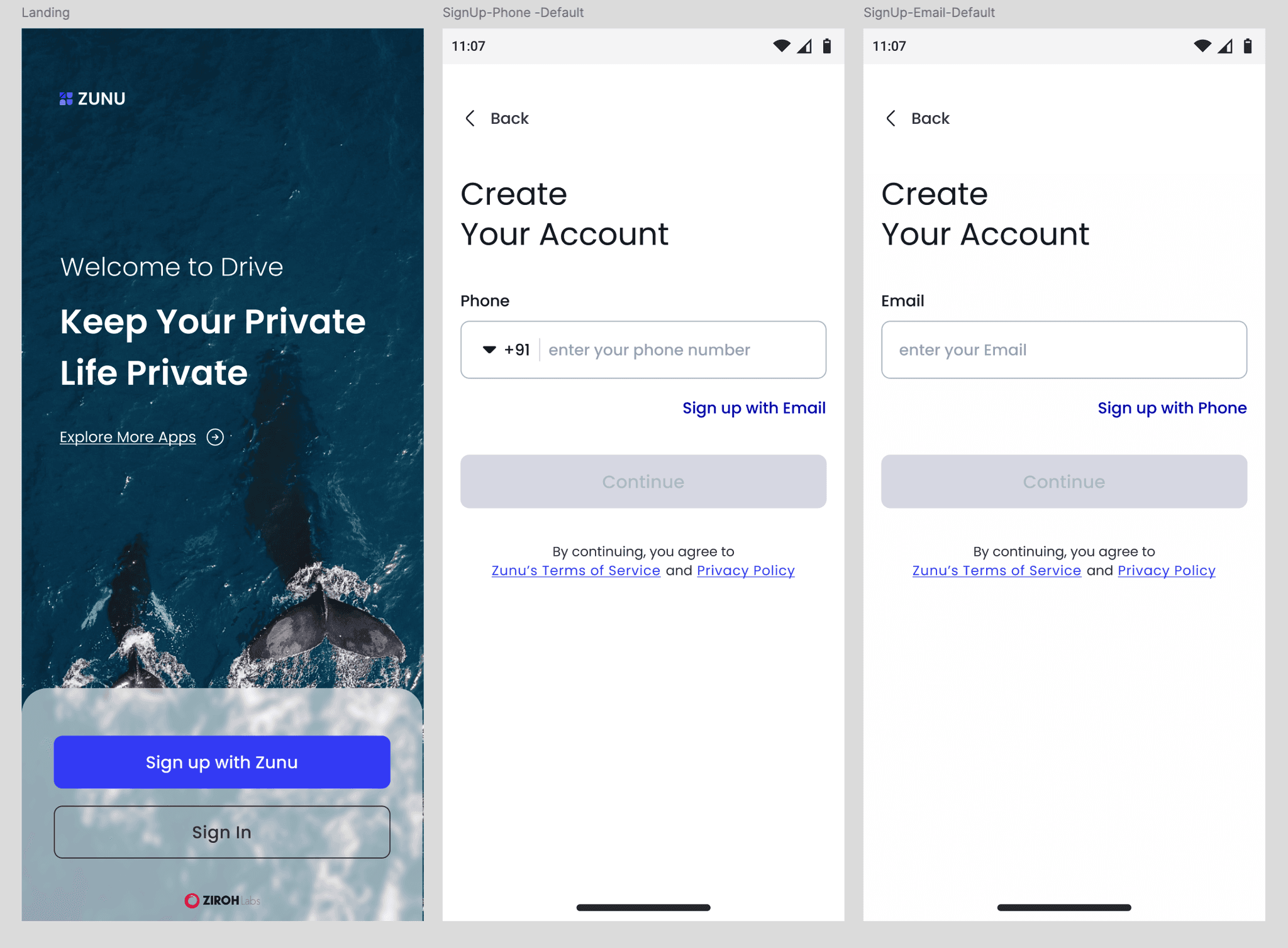
Zunu
Drive
Camera
Message
We followed the Branded House architecture because Zunu includes drive, mail, camera, and messaging, all of which are interconnected.
Now, we understand which design system architecture is best for Zunu.
There are two ways to introduce a design system into a product:
Build the product with a design system from the start.
Integrate a design system into an existing product.
There are two approaches to building a design system:
Approach 1
Build / Adopt: Create a new design system or adopt an existing one.
Use: Teams start using the design system.
Overload: As new components, colors, and typography are added, the system becomes cluttered and less effective.
Diverge: Some teams explore new creative directions, causing inconsistency and fragmentation.
Abandon: The system becomes outdated and is no longer followed.
Rebuild: The only option left is to rebuild the design system.
Approach 2
If you have a full-time design system designer, they:
Build: Create a design system.
Use: Teams start using the design system.
Maintain: Continuously manage and update the system.
Re-use: Designers begin reusing components efficiently.
Deprecate: Remove components that are no longer useful.
Re-customize: Modify existing components instead of rebuilding them.
Approach 2 is Failed, why?
Build/Use: Building and using a design system is essential.
Maintain: If the system isn’t built correctly, it becomes difficult to maintain.
For example, if you define Grey 500 as your main color but later realize you need Grey 600 for hover states, you may need to adjust the color palette.
Re-use: Designers often create components for a single use case instead of making them reusable. Components should be designed to solve repeatable use cases.
Deprecate: If a component is no longer used, remove it from the system instead of keeping unnecessary component.
Re-customize: Instead of rebuilding a component from scratch, modify and improve the existing one.
This is mistake, then what should we do instead?
Solution
Build Your System Like a Monster
Make it as strong as possible. If you need auto layout, add it. If you need to learn, read. If you need to communicate, talk. If you need to research, do it. Do whatever it takes to make your system powerful and resilient.

Then moment system is built and used.

Protect like a child
Include only what truly benefits the system. Anticipate potential risks that could weaken it. Some people may explore new design trends without a clear purpose—be cautious of such changes.
Protect the system from unnecessary modifications to ensure consistency and stability.
4-Phase Process
A step by step 4 phase process that we follow to implement design system across product in ZUNU.
Product Audit
Style Guide & Tokenization
Define Design Principle
Master Library
Product Audit
Product Audit is the process of identifying patterns and inconsistencies in the existing product.
Put a Design patterns in the design system.
Inconsistent component remove.

Style Guide & Tokenization
Extract the fundamental building blocks of your product from the patterns identified during the audit and organize them into a clear, human-readable format.
Refine them as and when needed
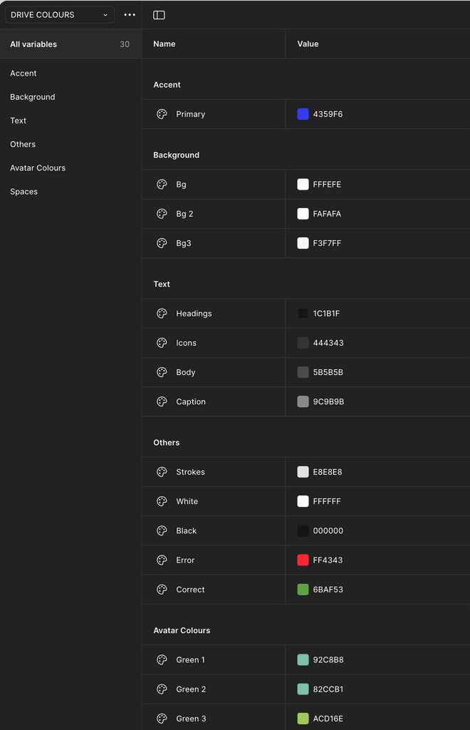
❖ Color System

❖ Typography

❖ Grid

❖ Iconographic
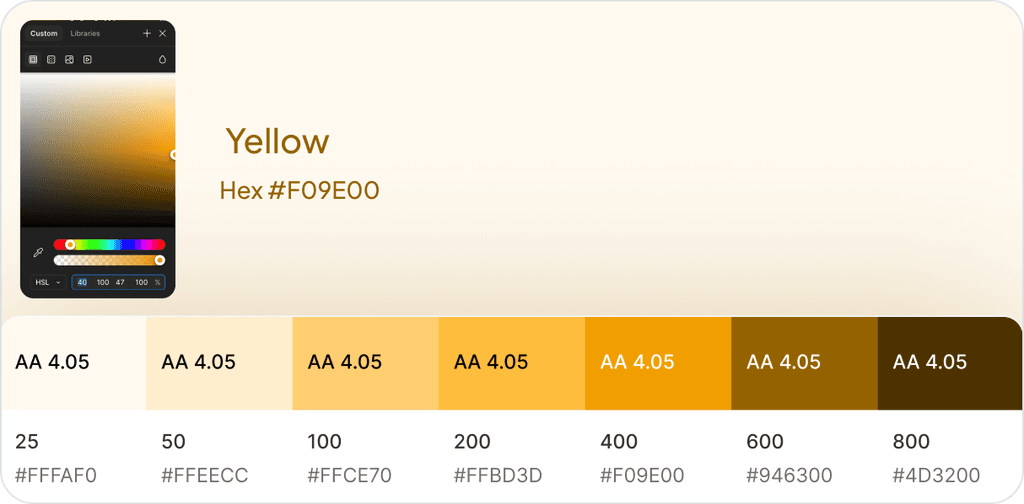
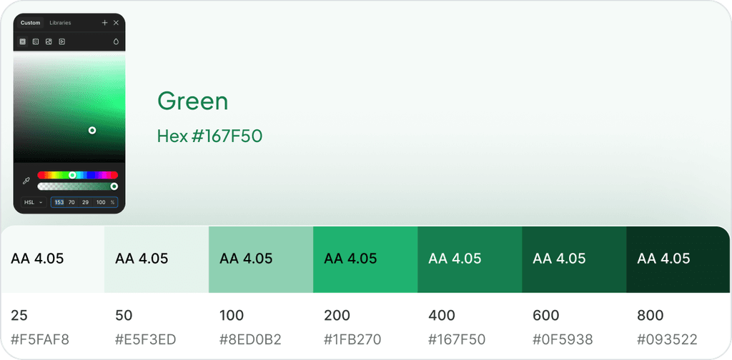
Color System
A monochromatic color scheme uses a single strong color with multiple variations of that color. The most common approach is to have one main color and adjust its shades by applying 10-90% white or black overlays.
Sticking to one main color can be a smart choice, as simplification often helps in introducing new concepts effectively.
😬Old
There is a lack of maturity in naming colors, and variable properties are not properly assigned to them.
😎 Gold
We assign proper names and variable properties to colors, ensuring the product's future growth and scalability.
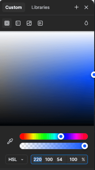
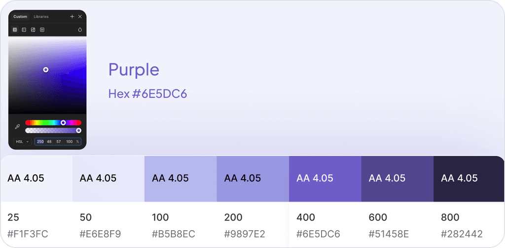
New Primary Color
As part of the brand guidelines, I chose blue as Zunu's primary color.
Hex code
#1463FF
AA 4.05
25
#F5F8FF
AA 4.05
50
#E8EFFF
AA 4.05
100
#C7DAFF
AA 4.05
200
#9ABCFF
AA 4.05
300
#6B9DFF
AA 4.05
400
#3E7FFF
AA 4.05
500
#1463FF
AA 4.05
600
#1154D9
AA 4.05
700
#0E46B5
AA 4.05
800
#0B3891
AA 4.05
900
#092D73
Neutral Color
We experimented with neutral colors by deriving shades from blue. This approach keeps our product looking fresh and clean.
Hex code
#172B4D
AA 4.05
0
#FFFFF
AA 4.05
100
#F1F2F4
AA 4.05
200
#EBECEF
AA 4.05
300
#DCDFE4
AA 4.05
400
#B3B8C4
AA 4.05
500
#8590A2
AA 4.05
600
#758195
AA 4.05
700
#626F86
AA 4.05
800
#44546F
AA 4.05
1000
#172B4D
AA 4.05
1100
#091E42
Accent Color
An accent color is used to highlight key elements in a design, such as buttons, links, or important text, to create visual emphasis and improve user experience.


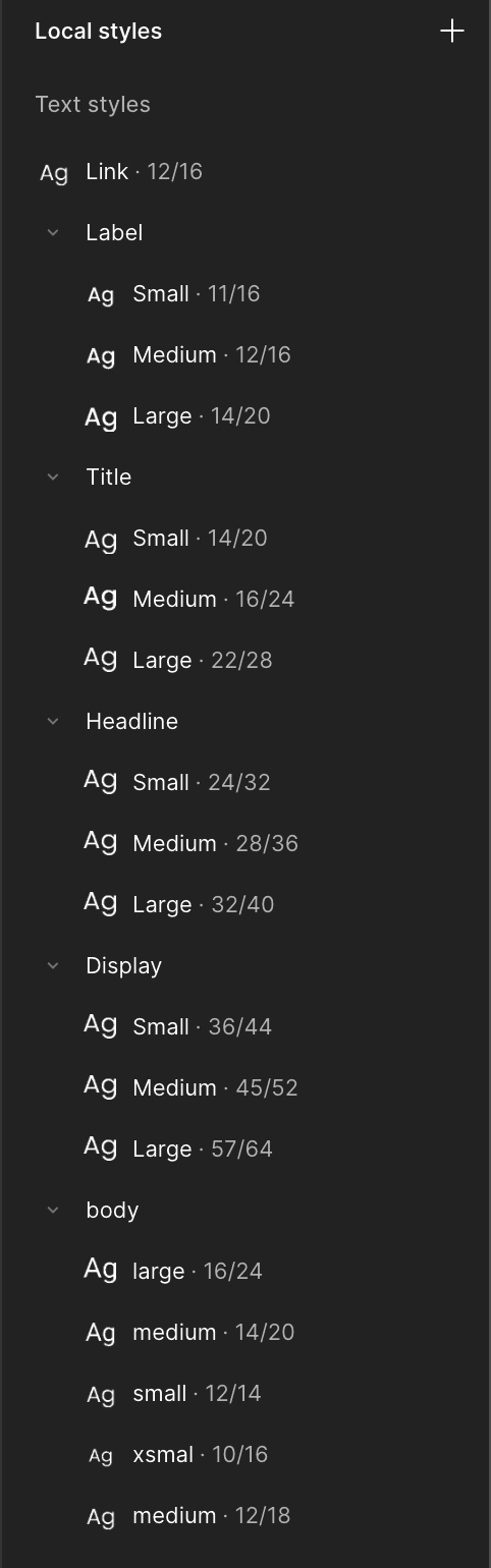
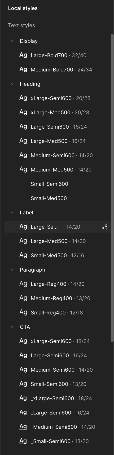
Typography System
Fonts set the mood of a product. We prefer geometric fonts because they have distinct shapes and lines, offering a modern and minimalistic aesthetic.
We selected these two geometric fonts for their modern and minimalistic appeal.
Plus Jakarta Sans
Display, Heading, Label
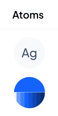
Ag
Medium, Semibold, Bold
ABCDEFGHIJKLMNOPQRSTUVWXYZ
abcdefghijklmnopqrstuvwxyz
0123456789 !@#$%^&*()
Inter
Paragraph
Ag
Regular
ABCDEFGHIJKLMNOPQRSTUVWXYZ
abcdefghijklmnopqrstuvwxyz
0123456789 !@#$%^&*()
😬Old
The previous font naming lacked, making decisions difficult. Using Poppins earlier led to issues with line height, letter spacing, misalignment, and inconsistent weight appearance.
😎 Gold
We implemented a proper naming system with variable properties. Plus Jakarta Sans is ideal for displays, headings, and labels, while Inter provides better readability for paragraphs.
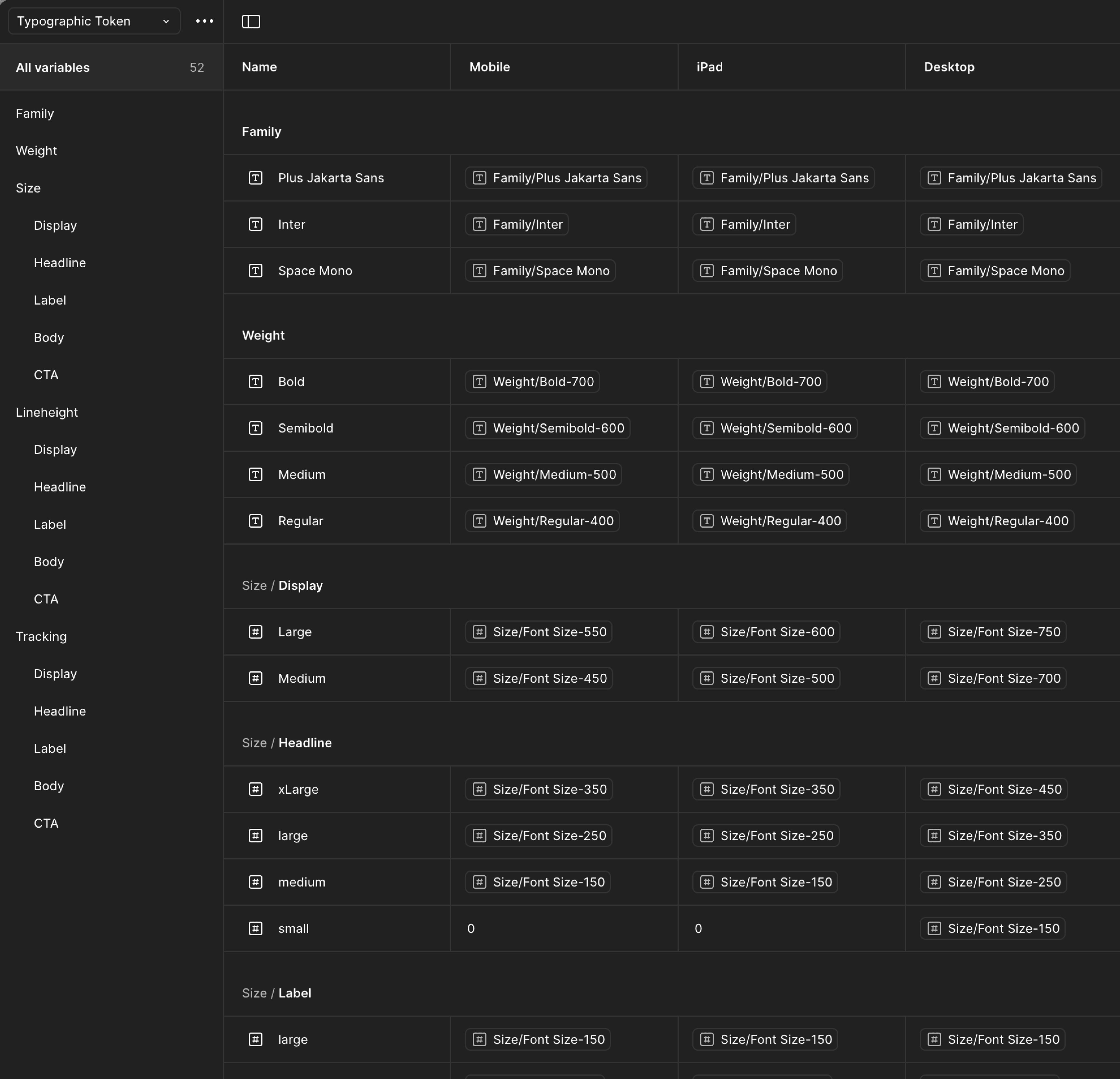
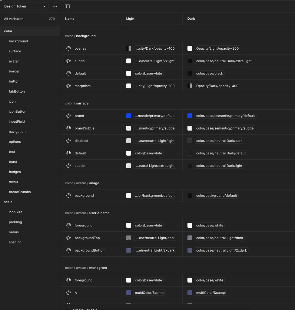
Tokenization
Design tokens are name-value pairs that store reusable design decisions like colors, fonts, and spacing. They ensure consistency and scalability across different platforms.

Raw
#1463FF
Primitive
darkGray-500
Semantic
neutral.default
Component Token
color.button.secondary.hover.background
scale.iconSize.small
scale.radius.default
scale.pedding.small
cta.small.semibold-600
scale.spacing.medium
Add to cart
Define Design Principle
Create guiding principles that align with your brand values and user experience goals. These principles will serve as a foundation for all design decisions, ensuring consistency, usability, and a cohesive user experience.
Accessibility : Create inclusive designs that are accessible to all users and comply with WCAG standards.
Simplicity : We deliver delight and satisfaction through a clean and focused experience every time.
Aesthetics : Use visual elements for artistic creation without excessive modification to provide users with an elegant experience.
Consistency : We create uniformity in design elements and interactions across all products.
Scalability : Develop scalable components that can be easily updated and maintained.
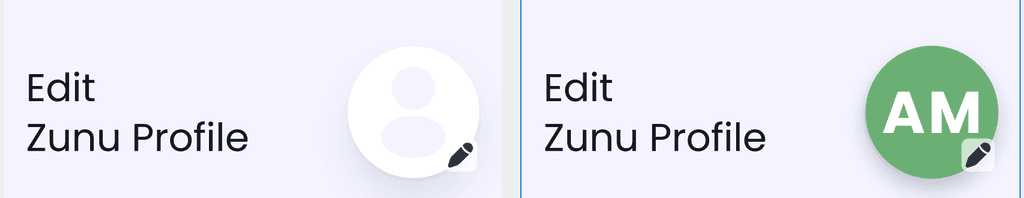
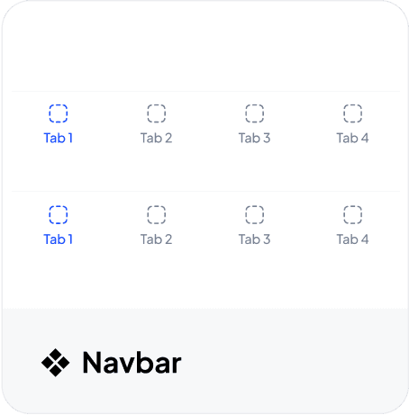
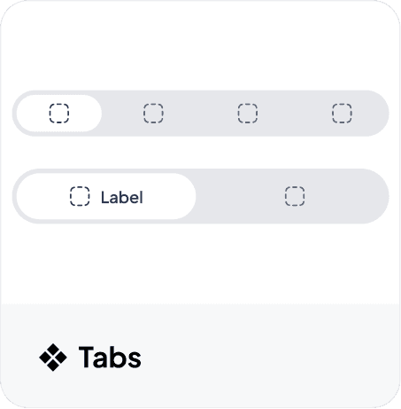
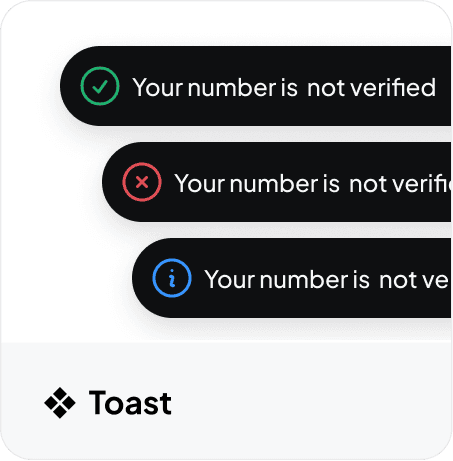
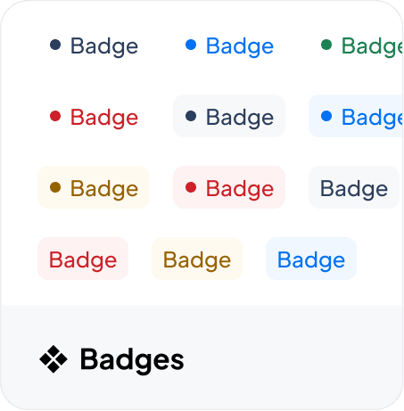
Master Component Libarary
Extract the components identified during the audit and define all possible use cases to ensure reusability and consistency.
We followed Atomic Design theory to build a component.
40+ ❖ Component
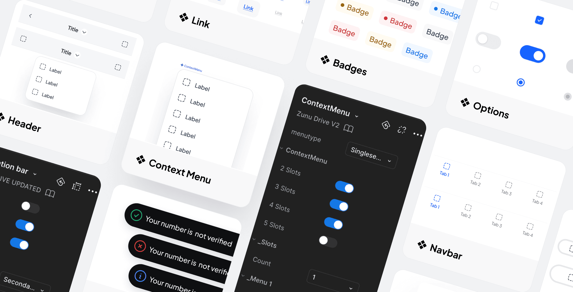
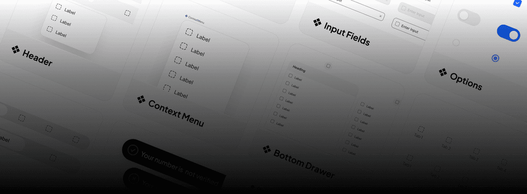
Showing a few examples from 40+ components.
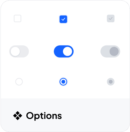
I created comparisons using a few components.
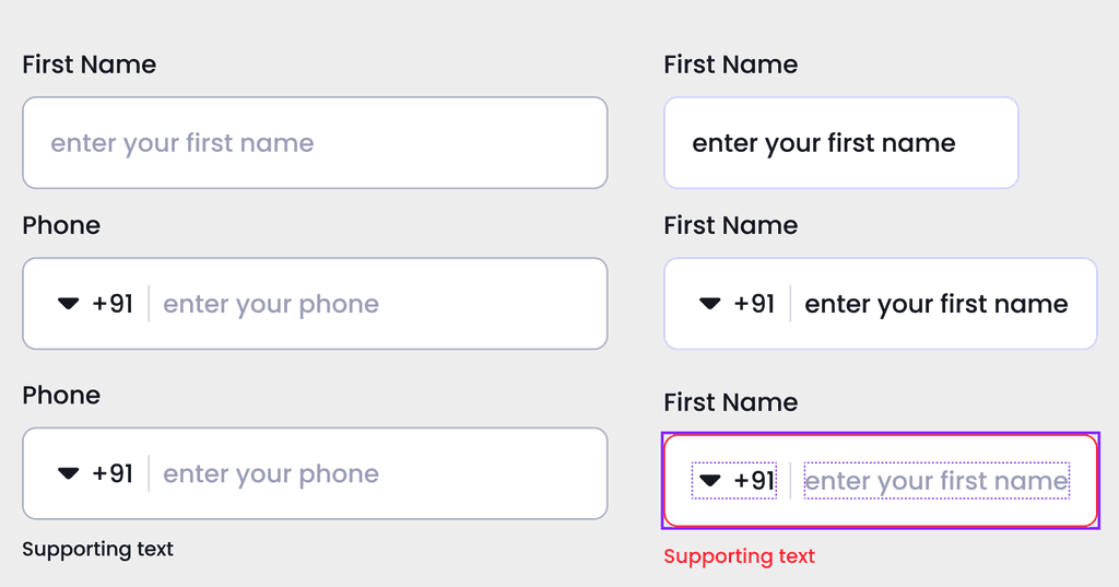
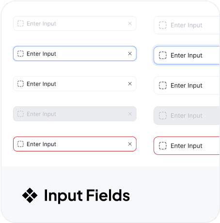
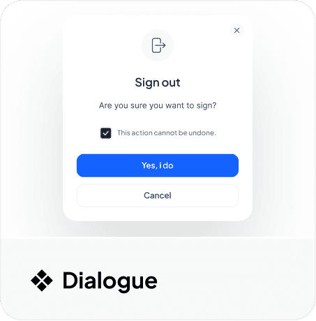
❖ Input Feilds
😬Old
Enter Your Email ID
Type mail here
Please enter email that you want to synch files with.
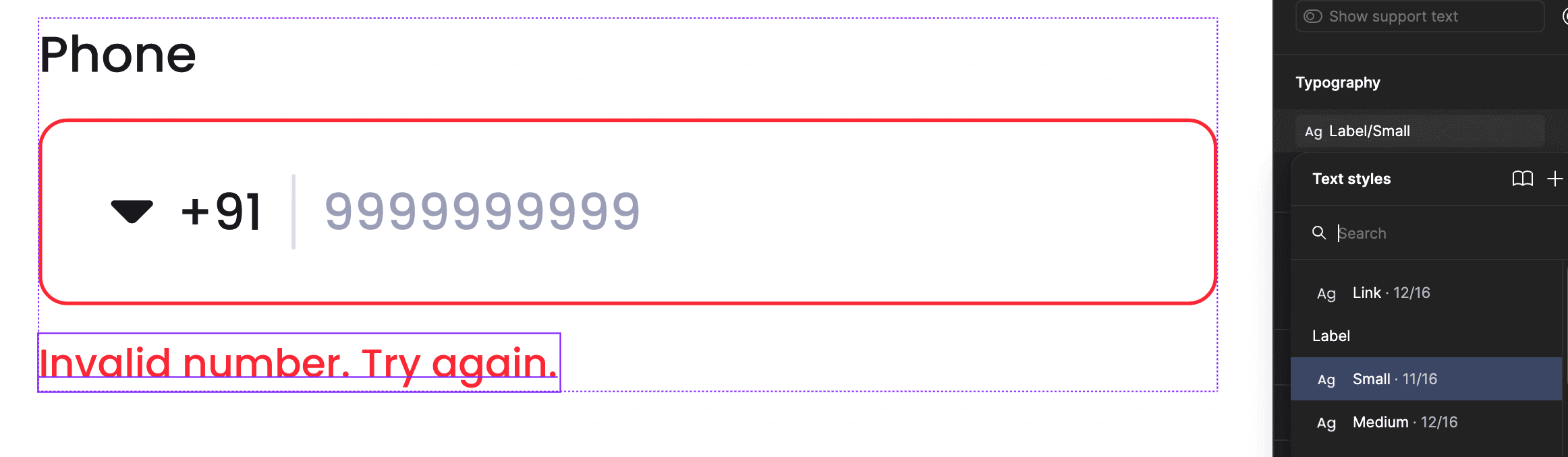
This input field component is not strong enough to support future growth.
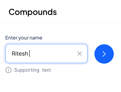
Full Name
riteshuiux@gmail|
Supporting text
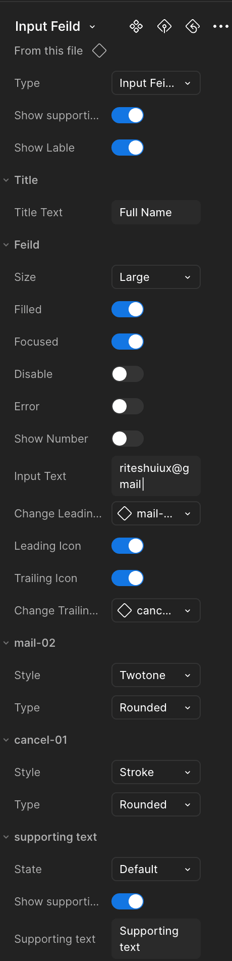
This input field component is highly robust, built using design tokens and variables. It allows customization of the label, state, icons, and supporting text.
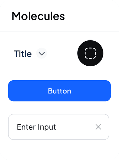
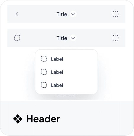
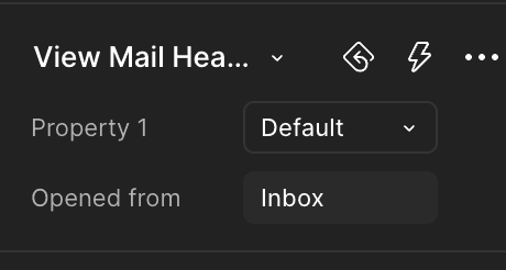
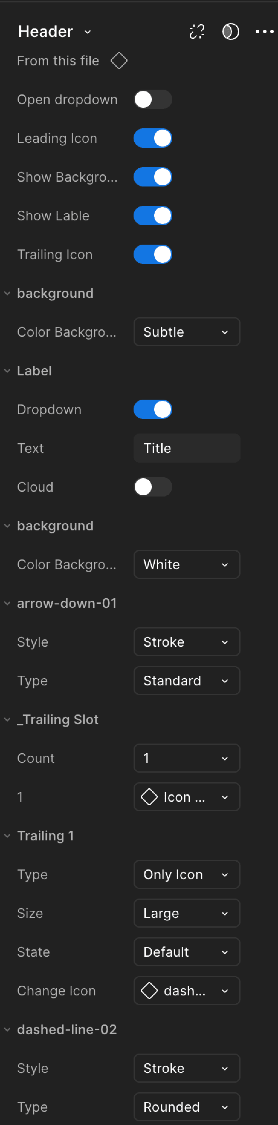
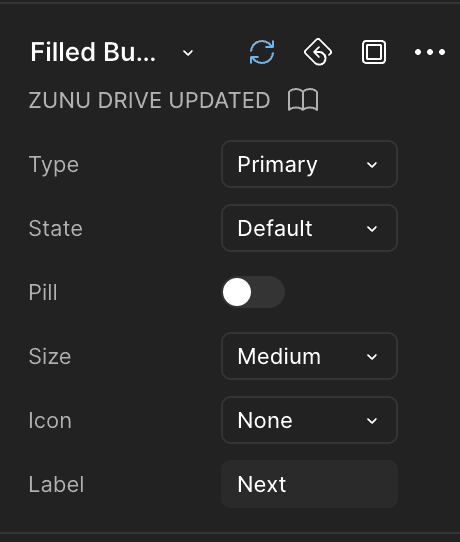
❖ Header
😬Old
This header component is not strong enough to handle future growth.
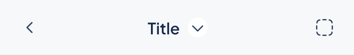
Inbox
😎 Gold
This header component is highly robust, built using design tokens and variables. It allows customization of the title, state, icons, and leading/trailing slots.
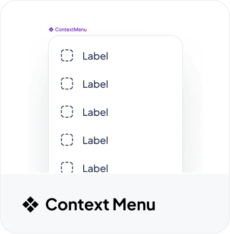
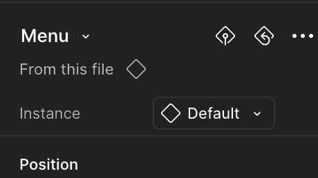
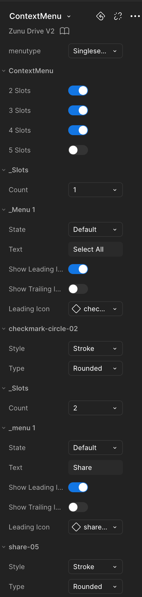
❖ Context Menu
😬Old
This Context menu component is not strong enough is handle future growth.

Notification
Recents
Trash
😎 Gold
This Context menu component is very strong made though Design tokens and variable. that you can customise Like title, state, icons, and leading/trailing slots.
Select All
Share
Move
Delete
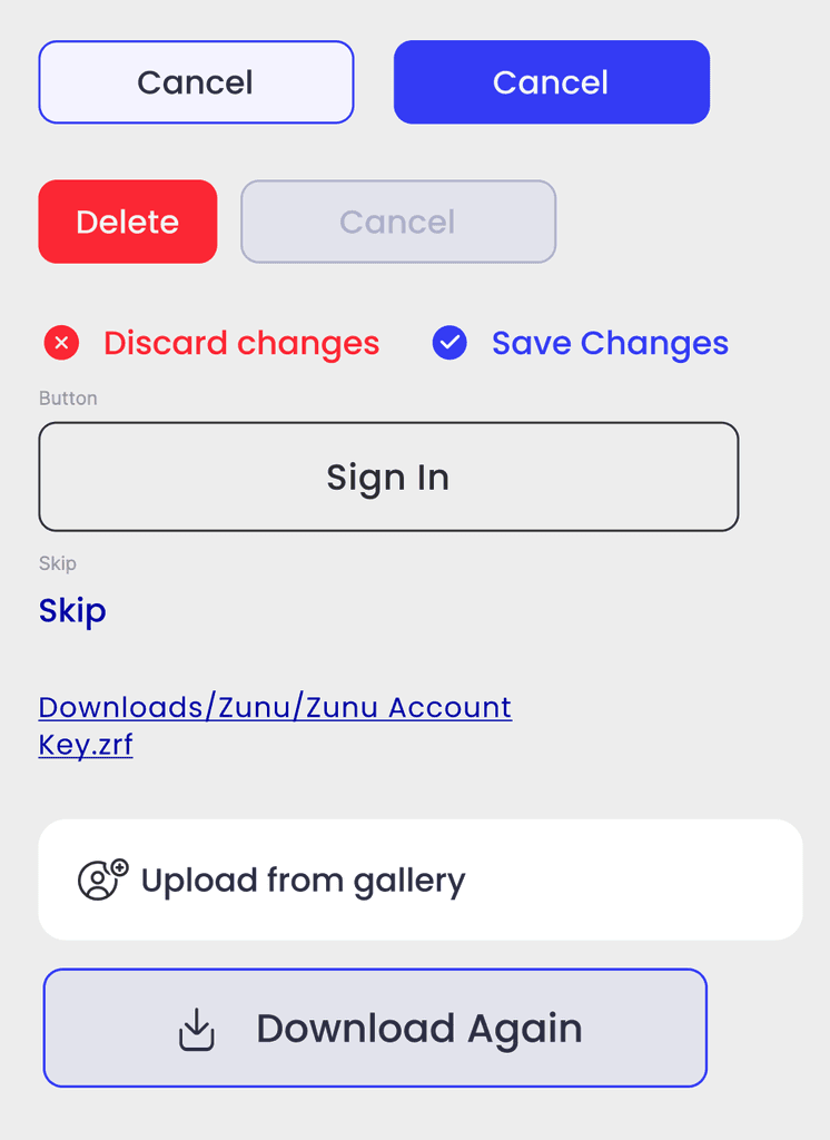
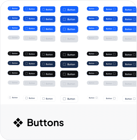
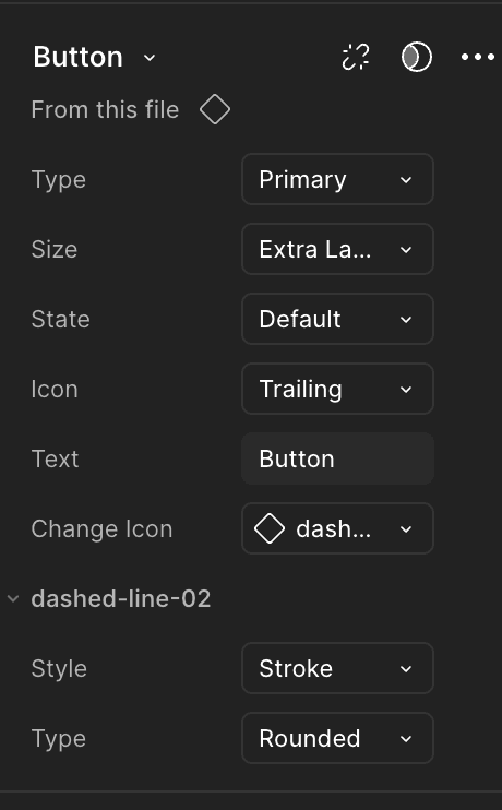
❖ Buttons
😬Old
This button component has limited variants, and its pill style lacks flexibility.
Primary
Secondary
😎 Gold
Primary
Secondary
Tertiary
Danger
Text-button
This button component is highly robust, covering essential variants for the product. built with design tokens and variables, it allows customization of text, state, and icons.
Release and Maintain
Once our style guide and component library are created and tested with designers, we officially release them for use.
We are thinking our job is done. Actually, design system job is started here.
So, we are maintaining the design system.
We repeat the 4-phase process to maintain and evolve the design system.
Follow 3E- Process
What is 3E- Phase Process

Educate

Engage

Evolve
To summarize 3E-Process
You talk to designer and teach them
Help them when they a need
Host a meeting and workshop
Raise the bar
Outcome of Design System
Modern Design
Consistency
Accessibility
Scalability
Templating
Testing
Design Principles
Thank you for Reading!
I would be happy to hear your feedback
